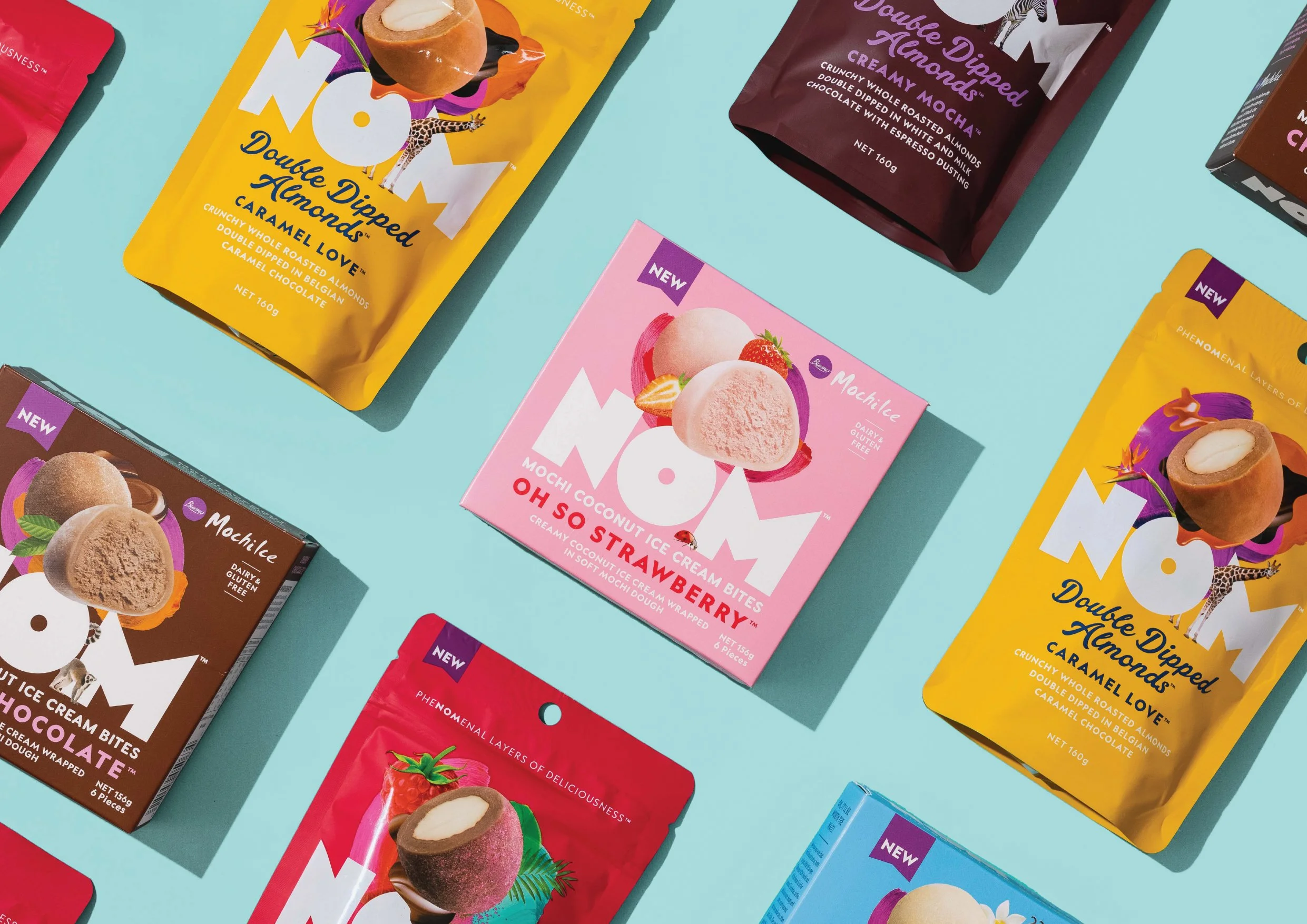
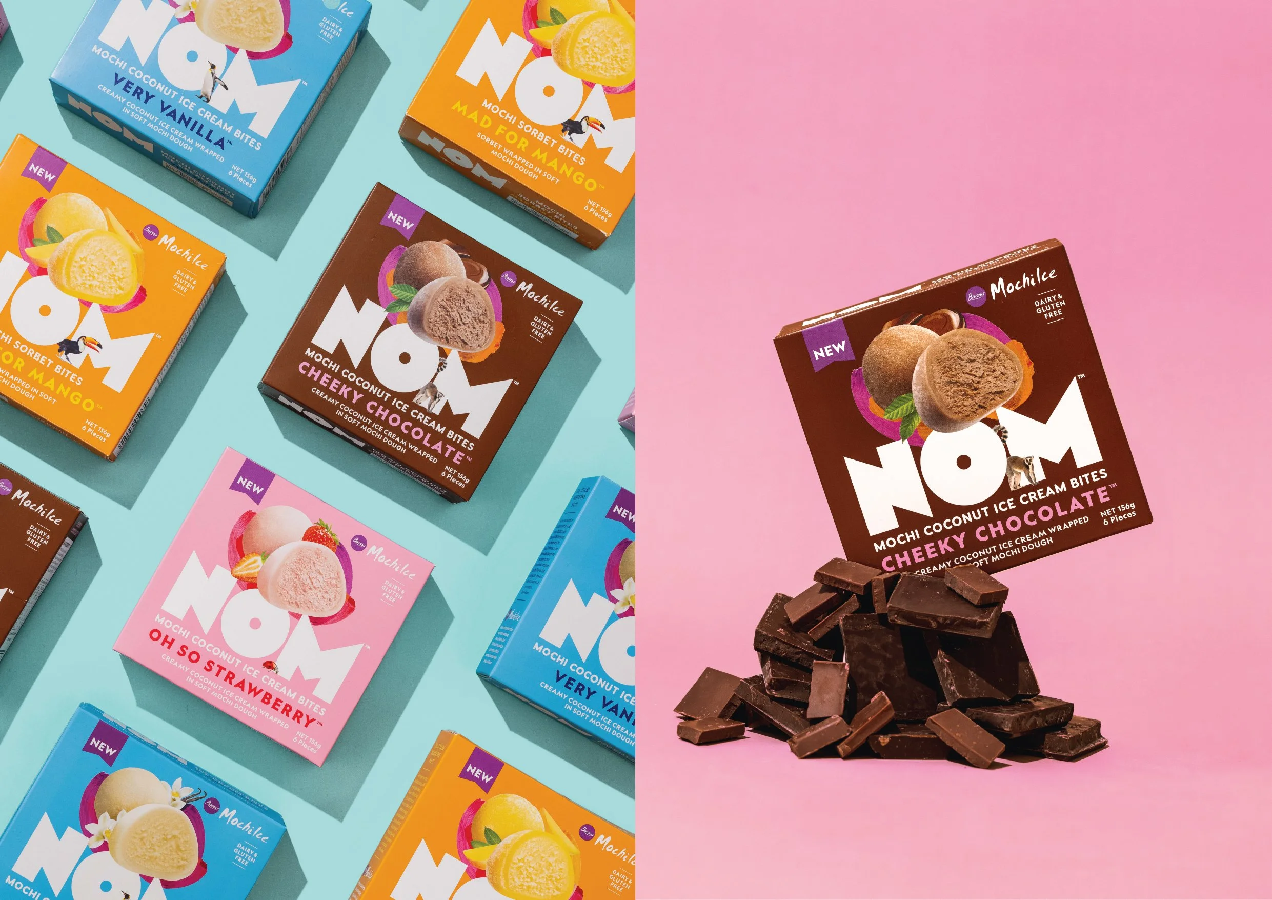
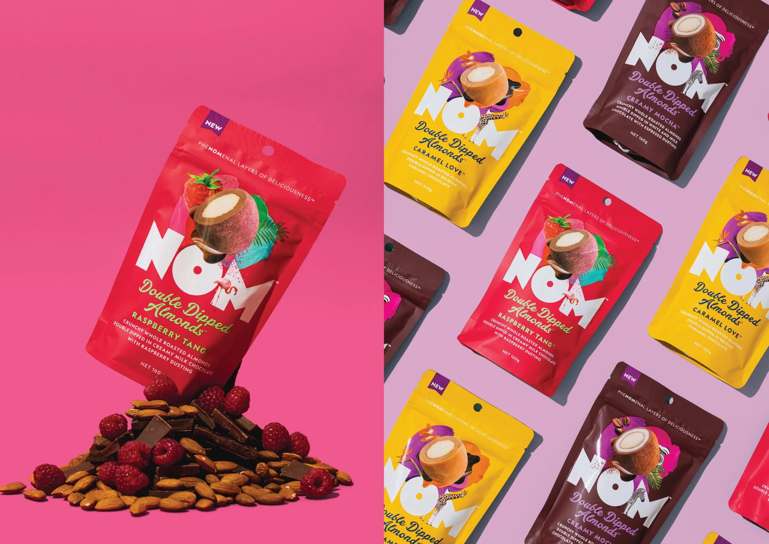
NOM is a Kiwi-born brand of bite-sized treats. To help launch NOM and create its identity, we were approached with a simple and inspiring brief: stimulate the senses and be boldly creative.
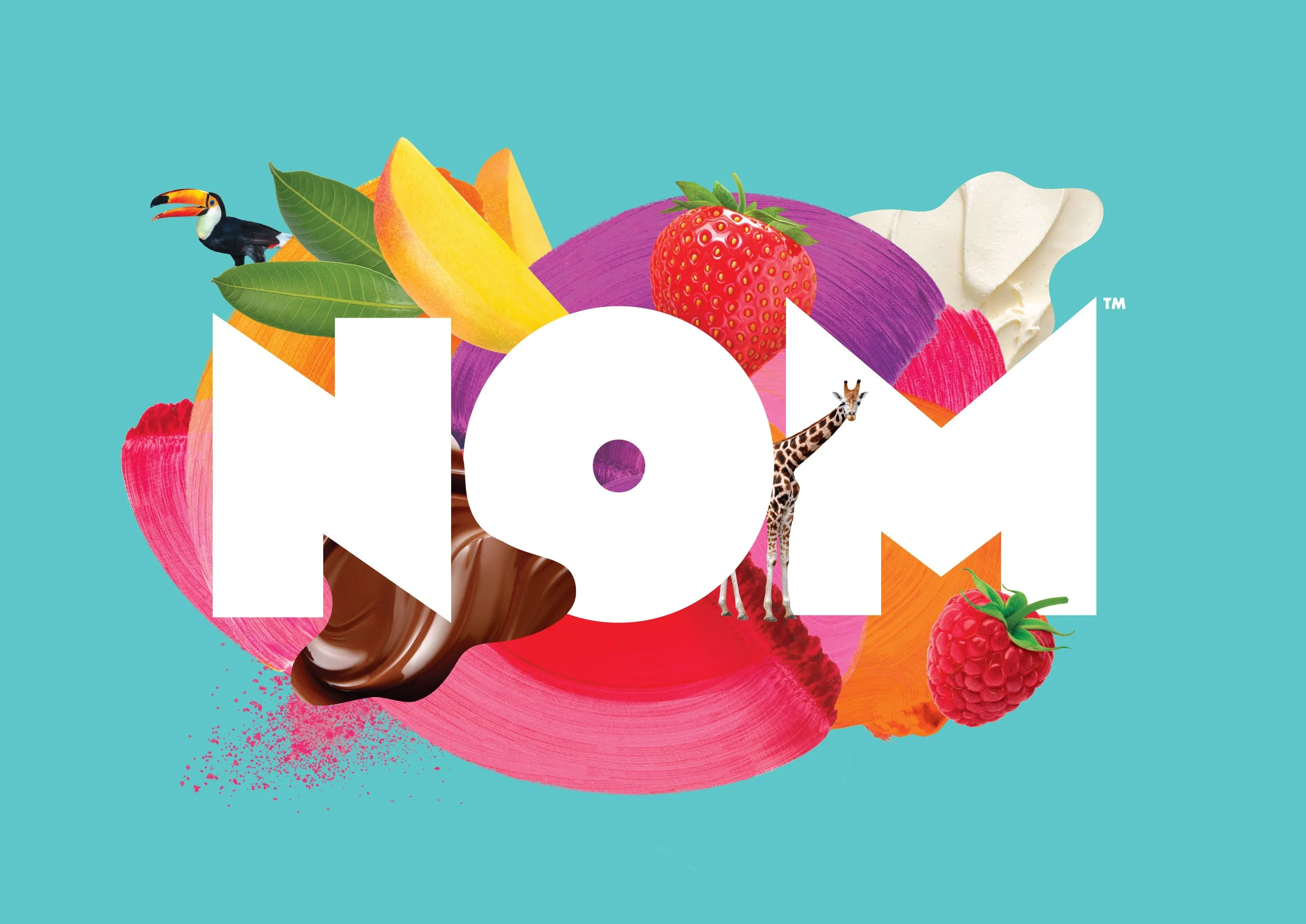
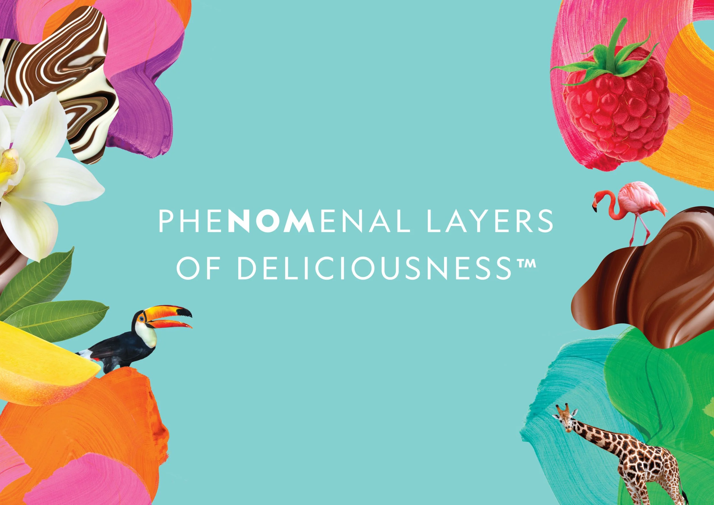
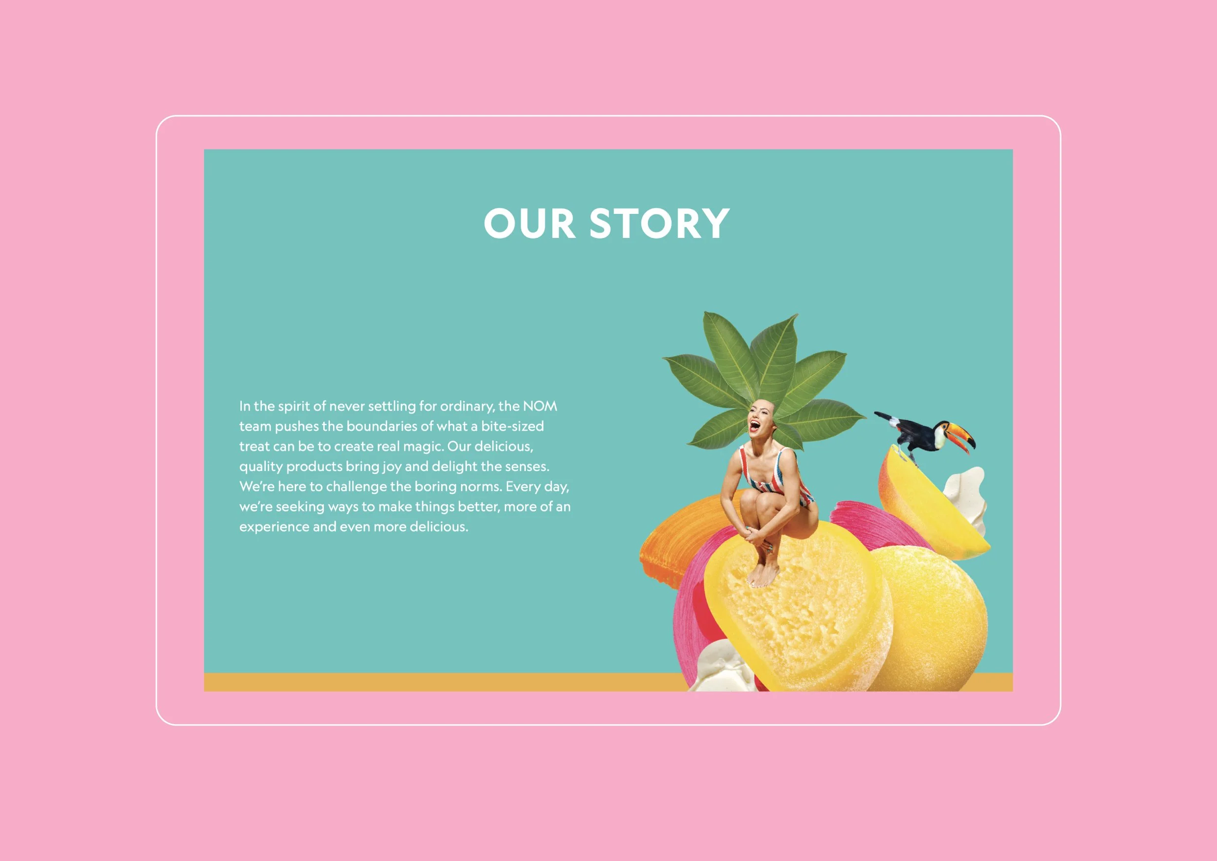
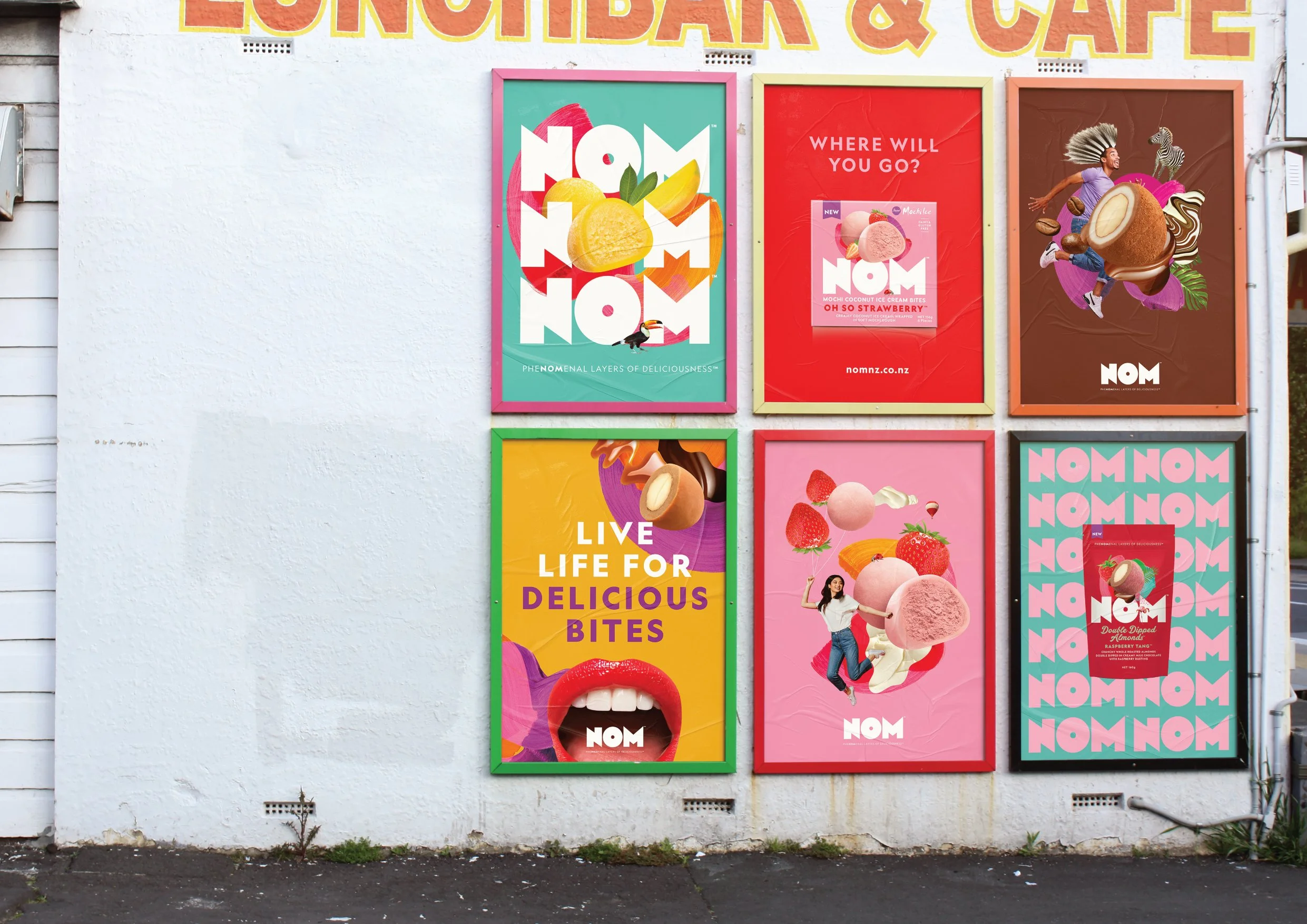
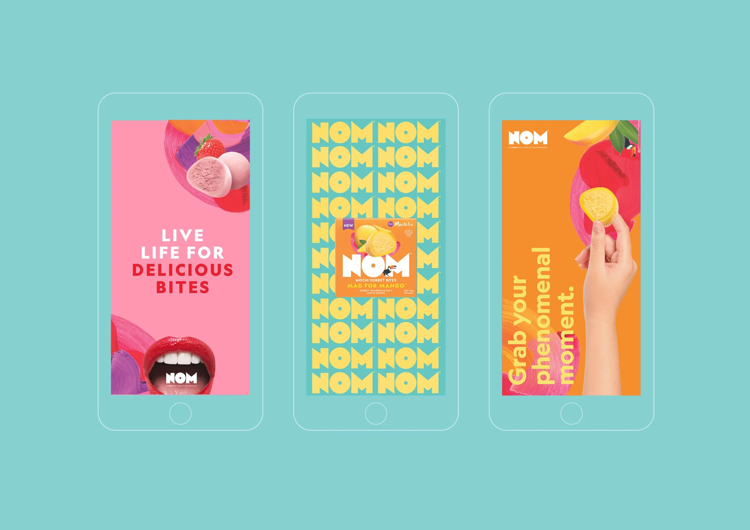
As a result, our brand platform revolved around the idea of creating magical bite-sized moments. To bring this thinking to life, I created a series of collages that represented moments when you bite into NOM and get transported out of the everyday, to somewhere phenomenal. These collages helped us bring together textures, layers and flavours of each NOM product and became the centerpiece of the brand’s visual language.
Paired with a vibrant colour palette and the bold logo which creates a powerful focal point of its own, we created an evocative brand identity that felt contemporary and fresh.
Work included ideation, illustration, food shoot art direction, right through to full pack designs, website and poster design.
Role: Design Director for Unified Brands.
Creative Director: Alex Butenko